Powered by Create your own unique website with customizable templates.
ALI MULLIN
  • Home
  • Portfolio
    • Publications
    • Typography
    • Video
  • Process
  • Resume
  • About
  • Contact


​Horse Sense(s)

The Product

​Horse Sense(s), handmade book, 2019​
Paper, ink and leather.
Picture
Picture
Picture
Picture
Picture
For an assignment in a typography class, I decided to focus my design and research on one of my passions: horses. This resulted in a very unique book that was a lot of fun to make. The content is mainly typographic with supporting hand-drawn illustrations that were converted to SVG files before being added to the digital document.

Writing was done with the horse in mind. While I was learning about these animals, I was thinking of my background experiences and the ways in which horses interpret information. The text is laid out on each page in a way that mimics ideas from my horse training background: reinforcing information on both sides, starting with a single 'lead line' for direction and creating very clear hierarchy in order to 'set the reader up for success.'

Since the book is about horses, I was sure to use materials and methods related to working with horses in the production of my final outcome. The one-of-a-kind cover was created using a scrap piece of leather from past projects. A couple of thinner strips were cut from that piece in order to create the closure and binding of the book. The closure is a simple strip of leather that wraps around the item to tie back on itself. The binding utilizes the bleeding heart knot which is common on saddles, bridles and other horse gear.

The Project

One Th1ng, Medicine Hat College, ARVC 315, Typography II
This project was an exercise in research as well as typography. We were assigned to create an item that was an in-depth study of any one thing, and present our findings in a creative way that was mainly typographic in nature. Based on my existing interest in horses, I decided to focus my project on equines. However, rather than populating the pages with information I already possessed, I decided to hone in on some of the finer details I wasn't so familiar with. 

The Process

Project Introduction
From the beginning, this was an exciting project. As a class, we were tasked with researching in-depth a very specific topic and compiling that information into some form as our final outcome. I knew right away that I wanted to take this opportunity to do a horse-related project (I try to sprinkle those in regularly, when I can). Throughout the semester, I had been working on my Grad Project, which also related to the equine industry, so I thought this would be a good way to work towards a common goal through two separate projects.
As with other projects, I started my process off by jotting down some notes to emphasize important project details that I needed to remember. From there, I made a web of ideas that were popping into my mind and began to identify connections between them.
Ideation
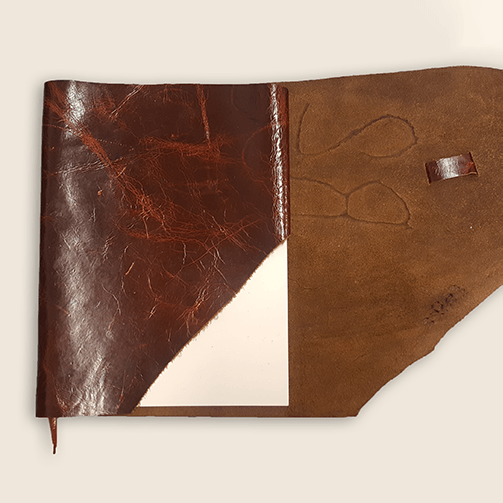
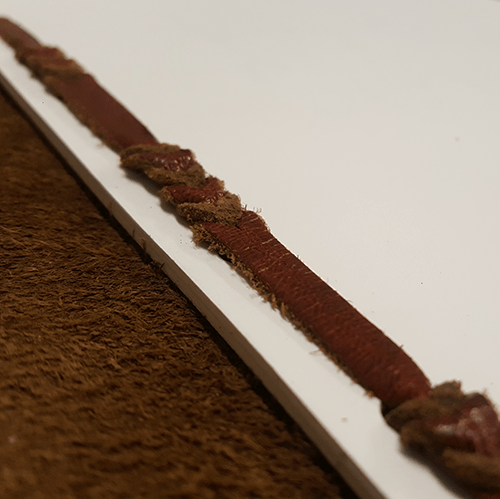
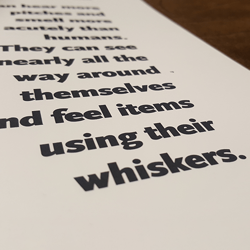
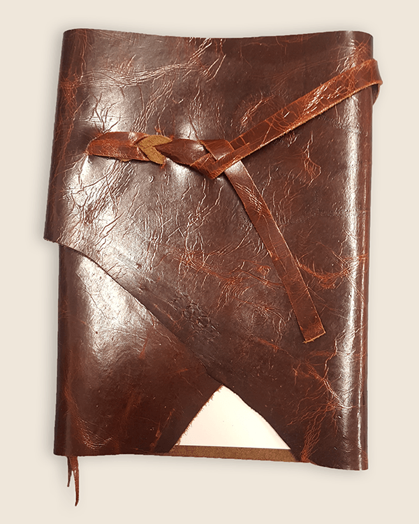
Having decided to make a book that would mix themes from horse training and typography, I refined my ideas over the next couple of weeks.  Planning the general layout of my pages, and giving some early thought to binding and covering my book gave me a good indication of the feeling of the document.

When I presented my ideas during our work in process critique, I received some good feedback that I compiled in my notebook for reference later on.
Content Creation
Though I've always been extremely interested in horses, I don't think that I've ever had so many horse-related textbooks at once as I did while researching and writing content for this project! After the trip I made to the College library, I don't think they had a lot left in stock. It was oddly satisfying to see them all stacked up on my desk.

After gathering most of the information I was looking for from these books, I used the internet as my secondary source of information. I wanted to be sure that the content I was providing was as accurate and up-to-date as possible, so I used a couple of recent articles and studies to supplement the more traditional information that I was basing the book on.
Picture
Though this final solution wasn't as many pages as I had been originally planning to make it, I think that I managed to fit a lot of important information on the pages I used.

Even in the layout of the pages, I tried to stay true to the theme of the book: how horses sense and interpret things. Even though there won't be any horses reading this, it is set up in a way that encourages readers to think like a horse would—or at least recognize what that would be like.

The most demanding text is the summary on the right-hand page of each spread. It might be an intimidating front if it was all even, so the first line is set out further, to help 'lead' the reader in. The spacious layout of the body text includes lots of white space to move through without feeling claustrophobic. Content is essentially repeated and reinforced from one side to the other, appealing to the idea that a horse sees two sides of their world, and needs to learn things from both sides. The running header and footer are just simple rules—you wouldn't want to repeat identical text over and over again, as horses can become overly desensitized with excess repetition and essentially 'turn off' their senses. The rules themselves are on alternate pages to reinforce the two-sided concept, without making it feel like the words are 'trapped' on the page. Information like page numbers and references are very small, so as to not be distracting.
Reflection & Rationale
Something that I realized while doing my research for this project was that it seemed the more specific I tried to be (in an attempt to pare down content) the more important information seemed to come up. While I would have loved to make an in-depth document that covered everything about horses, that wasn't realistic. I did my best to concentrate on providing the information the I felt would be the most useful and unique about the species.

Overall I'm pleased with how things came together, and that I was able to play with certain areas of text some, while also keeping a unified feeling throughout. I am especially happy with how the cover and binding came together, using some old leather with a raw edge and a bleeding heart knot that is popular in leather tack and equipment. This is definitely something I think it would be fun to add content to in the future!
Previous Project
Let's see some Typography
Powered by Create your own unique website with customizable templates.
  • Home
  • Portfolio
    • Publications
    • Typography
    • Video
  • Process
  • Resume
  • About
  • Contact