|
Just FYI:
I'm in the PROCESS of moving my PROCESS. It has been quite a PROCESS, and might take a while to PROCESS. The Political Type: AdverteasingARVC 315 Typography II Final Project
Project Introduction
For this final assignment, we were tasked with creating a final outcome that made some sort of statement. It didn't necessarily have to be political in nature, but had to express an opinion, with the goal of accomplishing communication through getting a response and a reaction from the audience. We looked at quite a few political examples in class before moving on to our own brainstorming.
Ideation & Research
For my solution, I knew that I wanted to shift away from the horse concept a bit, since I've been working fairly extensively in that area lately. I put my pen on some paper, and did quite a bit of brainstorming before I came up with my initial concept:
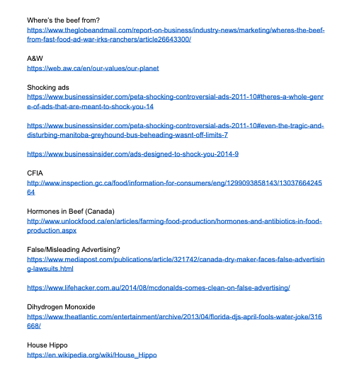
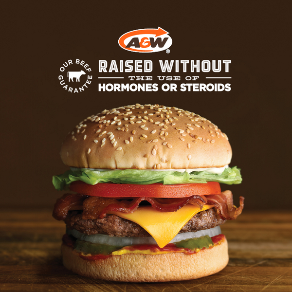
I wanted to create and implement some sort of marketing campaign that would serve to call out certain brands and companies that use biased and misleading 'fear marketing' in the sale of their products. I compiled a Google Doc that listed some sources of information and inspiration:
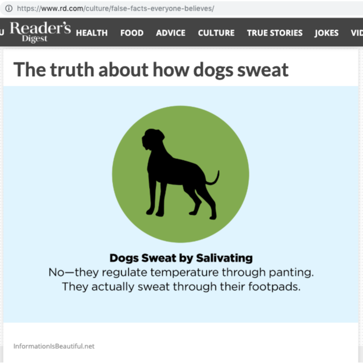
When I took my idea to critique, it was still pretty much just a concept. I had done some research to gain ideas and background, and I had a couple of specific brands that I was thinking of focusing on. I also was considering doing play on the concept of 'fear marketing' by creating a variety of my own advertisements and product packaging designs that would create a sense of fear surrounding products that we know are perfectly safe (water, apples, etc).
After talking things through in critique, I realized my concept was still very general. While it was definitely something that I wanted to be able to express to the world, I decided I would need to simplify and be more specific in order to finish in time. Content Creation
In simplifying my chosen topic, I opted to focus less on calling out specific businesses, and more on raising awareness within consumers themselves. As viewers of content, consumers have responsibility in interpreting the information that advertising and media throws at them every day.
The way I planned to do this was through 'spoof' magazine ads, inserted into magazines that would be placed back on the shelf where consumers could pick them up and use them as any other magazine. Planning and brainstorming notes:
I felt it was important that these various ads be unified in some way. A bunch of random, misleading ads could be confusing or just plain ineffective, but if they had a common thread running through them, it would add a bit of legitimacy, as well as some sort of platform for spreading a message, and a way for consumers to get more information if they wanted to. That said, I didn't want for it to be initially obvious that they were related.
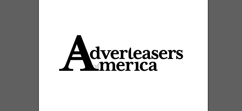
With that in mind, I created a quick little campaign logo of sorts:
Adverteasers of America: a fictional company that works to raise awareness of the responsibility the consumer has in consciously interpreting and understanding advertising and promotions used by modern companies.
For this portion of the project, I went with the name Adverteasers of America because most of the magazines I was going to be placing my anti-ads in were American publications. It was important to me that the logo looked legitimate enough to be convincing to the average viewer, but also a bit ridiculous, pointing the finger at some of the ridiculous issues the company focuses on. In order to accomplish this task, I used a serif font (Mrs Eaves—which is named after a mistress, so it has some controversy of its own) for a feeling of time-tested reliability. The two capital 'A' characters combine into one letterform with two crossbars. In this way, the logo itself encourages viewers to 'read between the lines.' Within the logo, the Adverteasers of America have very literally not crossed their t's or dotted their i's. The word 'of' is tucked in the background of the logo, with the appearance that it is almost hiding behind the other words. These things work together to indicate the incomplete or misleading information provided in many mainstream advertisements. So this logo became the unifying factor within my anti-campaign. For the ads themselves, I actually tried to make them each look quite different so they would 'blend into their surroundings.' Fonts, colours and imagery were pretty much all dictated by the magazines they were going in, or the ads they would be placed beside. Then, I planned to place the logo as well, so that people actually had to stop and look for a little while in order to realize that my ads were related at all. Advertising is diverse and widespread—so much that sometimes we don't even realize we're looking at advertising! I felt it was important for my ads to cover a wide range of topics, in order to address that. Design & Development
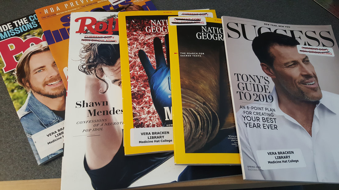
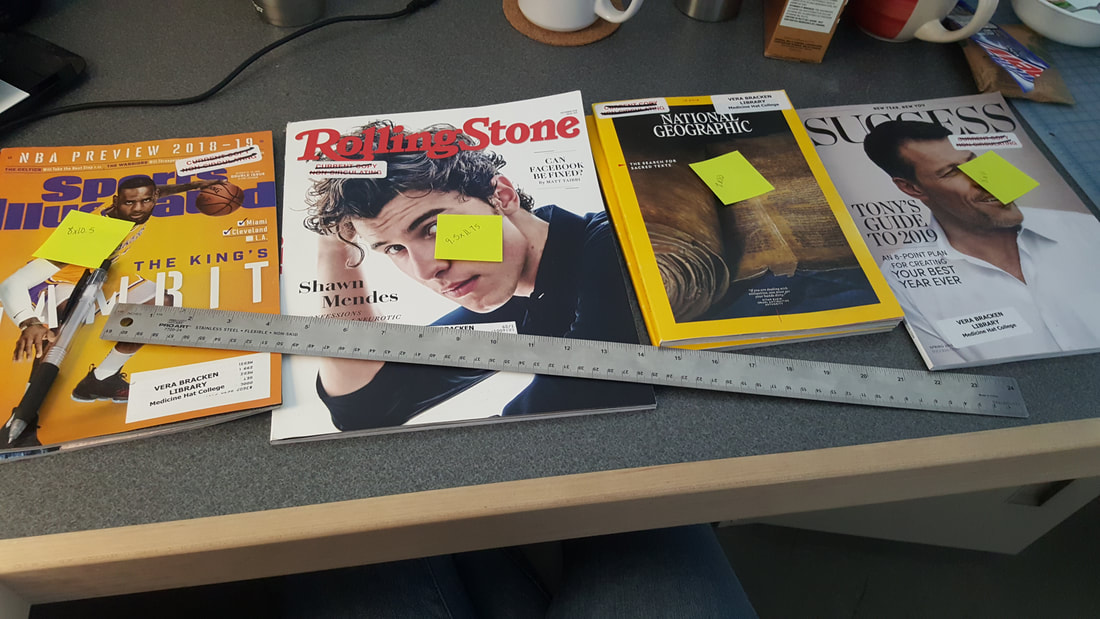
My design actually started with a trip to the MHC Library to get a few magazines. I wanted popular magazines with lots of commercial advertisements, so that my pages could fit in (mostly) unnoticed. I measured the dimensions of my selections, so that I could design according to each magazine's individual page size.
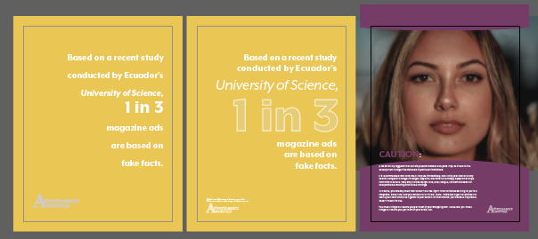
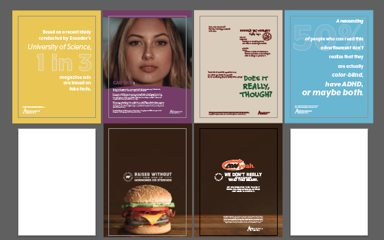
With my magazines picked and measured, I flipped through each one and found a couple of places where I could design my own pages that would correspond or interact with the opposing pages. I also had some ideas in mind already of independent pages that I wanted to do, so I got to work in Illustrator. From the Library selection, I chose three magazines where I would concentrate my efforts (returning those later), as well as one of my own magazines (for submission).
Once I had designed my pages, I printed them, cut them down to size and added them into the appropriate magazines. I had initially thought that I would need glossy paper (which I already had), but it turned out that the magazines I picked had very light-weight paper that was somewhere between matte and glossy. Fortunately, the paper in the College printer ended up being a pretty close match.
The plan was to place one ad in each magazine, including the one that I would eventually submit as my final piece. While printing however, I decided to re-size and print extras of everything, so that I could have a copy of each ad I created included in my final piece. Since some of them were created as supplements for specific ad spreads in their individual magazine, there's a few that don't really make sense within my final submission, but I wanted to include them all for reference. Even though I'd done some trial runs, there was a bit of troubleshooting when it came time to glue my additional pages into each of the actual magazines. I was able to get them secure and concealed with some persistence, but opted to leave the pages within my final submission loose. The hot glue method worked just fine as a mockup for my assignment, but I like to think that the Adverteasers of America would use a more refined method than simply adding the pages in with hot glue.
With everything assembled, I took some photos of my final outcome(s):
Reflection & Rationale
This assignment is a good one to end the school year on. With the idea being that even as students, we have opportunity to make a statement through our designs, I think that's a nice way to head out into our work terms. Especially for myself, it really reminded me of the responsibility we have as designers, and our power of influence over audience perception.
While I still feel that inaccuracy in advertising or misleading advertising is still a very real problem, I don't particularly think it's something we can regulate or enforce rules on. Such is the nature of our capitalist society. However, in this way I think that my decision to shift focus from calling out specific brands, to reminding consumers of their responsibility was effective. As with many things, advertising is subjective. How do you begin to define what is appropriate and what is not when the very nature of the field is in competition, and finding the next new way to one-up your opponent? Rather, it's important to remind consumers that they ultimately have the power to ask questions, do their research and make decisions for themselves, rather than trusting whatever they see printed/posted/published. Early on in this project, I did have plans to make a bigger 'anti-campaign' than what I did. Originally, I envisioned a run of print ads like the ones I did, accompanied by various social media posts and memes, and maybe even some accompanying posters. In the rush of the end of the semester, my simplifying meant that I cut out the social media and posters in favour of being able to focus solely on print advertising. I do feel that social media especially would be an effective way to address this issue, as people spend a lot of time on social media, and often 'share' things without checking to be sure that they are actually true. That said, I found creating magazine ads and fixing them into actual magazines that have the potential to go back out into the public was more fun for me than simply mocking up the right dimensions of social media posts. Overall, I'm glad I made the switch from focusing on advertisers to consumers. The reduced scale of the project was necessary and just because I didn't use social media as a platform doesn't mean I can't revisit that option in the future. While I did have a bit of trouble with assembling the finished products, I think they were still fairly convincing when I was done, and I don't think it's necessary for them to be perfect. The main goal is just for these ads to maybe confuse people a bit, force them to stop and think and to recognize how quickly they accept things as fact, without doing proper research. Ideally, it will encourage people to create a habit of finding reliable sources to back up their decision making in the future. I was happy to have the opportunity to give some thought towards addressing this issue. It's something I've been aware of and frustrated by for quite a while, but it never really occurred to me that I could do anything about it. It's nice to think that even one person might see an Adverteasers anti-ad and decide to look into things further next time they see an ad that just seems too good to be true. Grad Show Marketing: ExposeARVC 499 Special Projects and Exhibition Process
Hard copy notebook submitted at my desk, digital copy provided here for reference:
One Th1ng: Horse Sense(s)ARVC 315 Typography II Project 3
Process for this in included with the project listing in my PORTFOLIO.
Digital Portfolio: Ali Mullin, April 2019ARVC 499 Special Projects and Exhibition Portfolio Process
Once the analogue portfolio was complete, it was time to shift my focus to creating an online presence that would be consistent with what I had established. Having the analogue portfolio in place served well to help dictate how the online version came together. Similar to before, I had somewhat of an online presence already after the portfolio prep class last semester. However, I wasn't very happy with it, so I scrapped pretty much everything from that one, except some of the photos, which I was able to reuse.
My previous online portfolio:
There were a few different issues I wanted to remedy in creating this new portfolio. To me, the 'feeling' of this online interpretation didn't really match what I had established in my analogue portfolio. Functionality also presented some issues, with people having trouble navigating or accessing certain information. I wanted to have a simpler web address, with a more obvious connection to me. I didn't really love the layout, the format, the system I made it in—I didn't really love much of anything about it, come to think of it now!
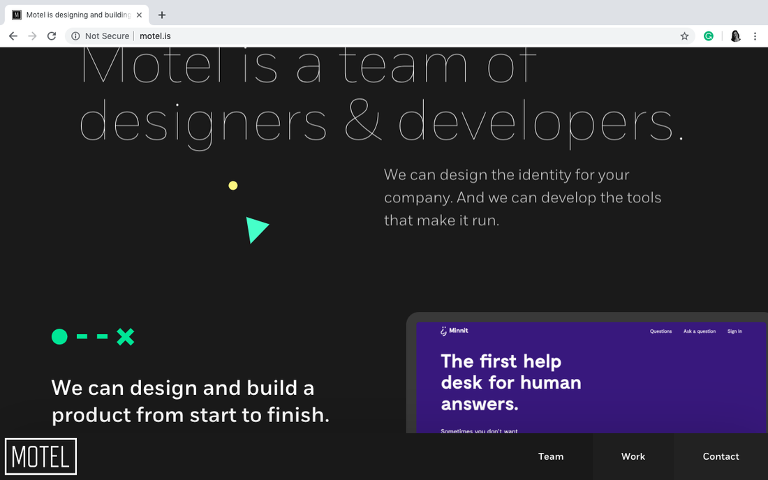
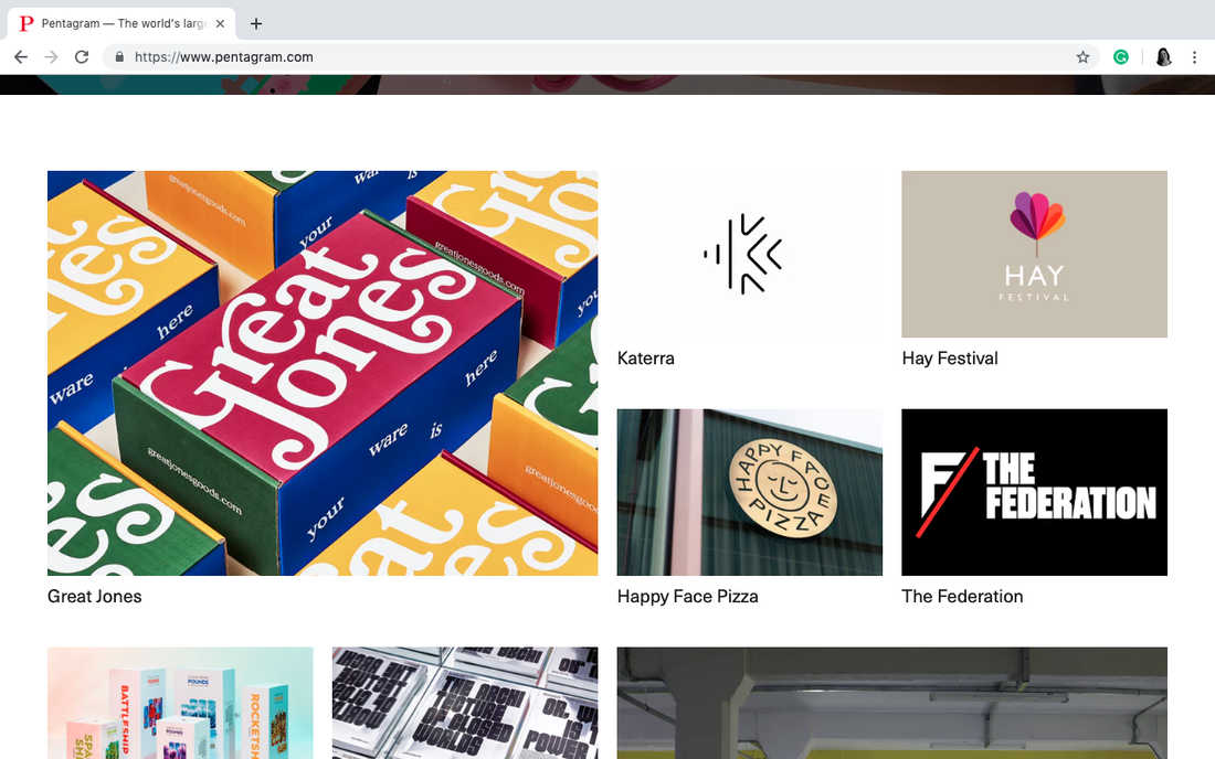
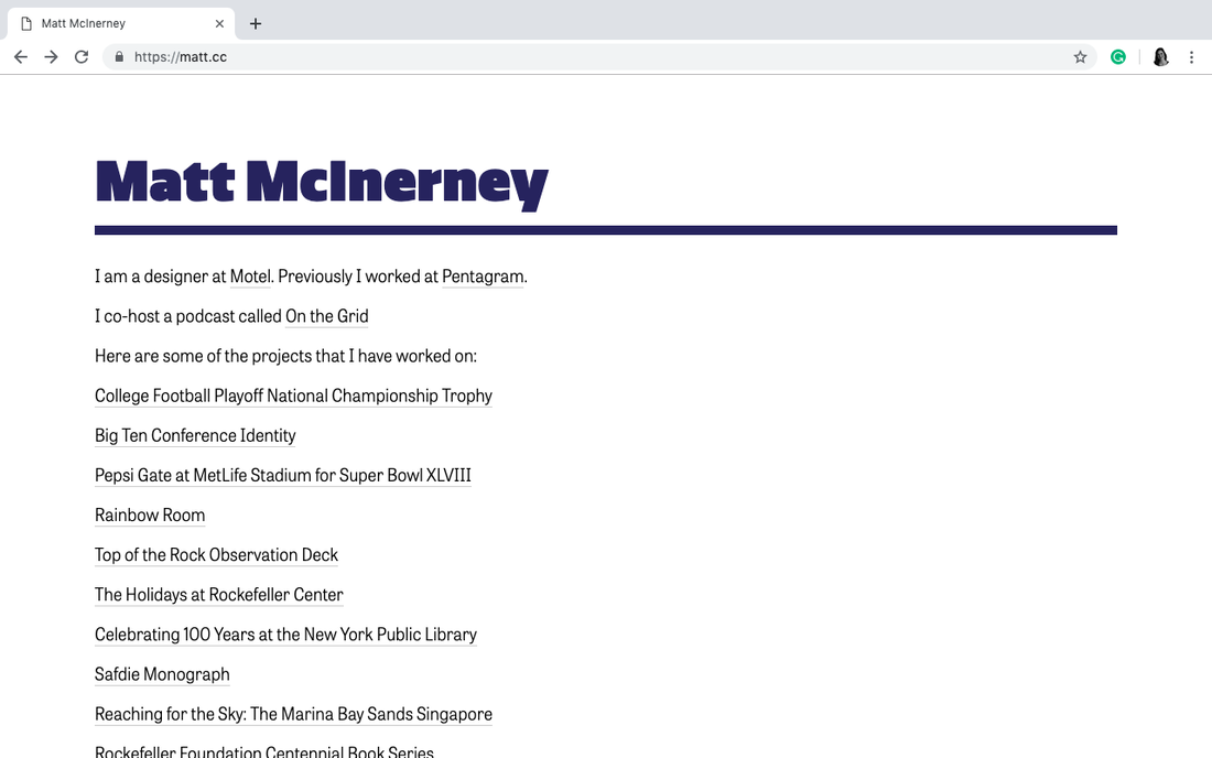
In order to create some consistency, I decided to use the same font that I had used on my resume, since I was planning on listing that document here. Raleway is a light, fresh typeface originally designed by Matt McInerney. He developed it while working at Pentagram, before moving to Motel. I liked the options provided by the variety of different styles and weights (added by Pablo Impallari and Rodrigo Fuenzalida later on). I also liked that it had balanced geometric elements, along with some elements that felt kind of personalized/humanized to me. For example, the curled ends on the t and the l are similar to my own printing style.
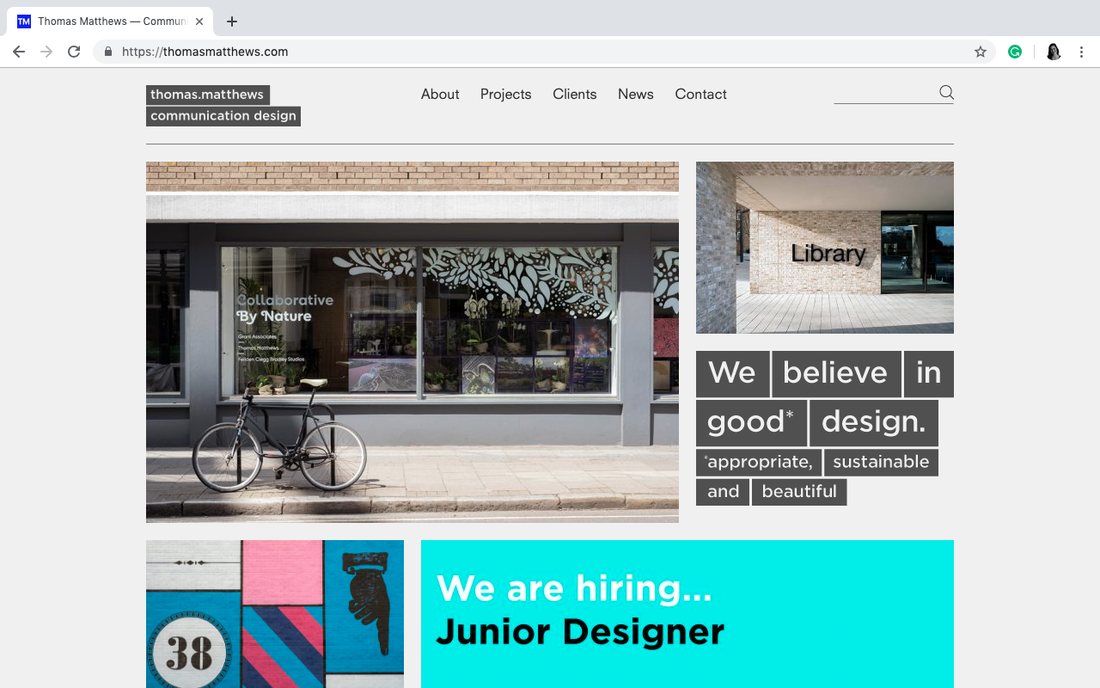
In doing this typographic research, it also led me to the online portfolios of these professional entities (linked above). I was able to use these as reference, along with some other sources I had compiled. One of the things I noticed with each of these was that they generally had every project identified on a main page. Sometimes this was done with only text, but usually with an image or with text and image in combination. From there, you could click the identifier for a particular project that would take you to a page including more photos, detail shots, and all written information on that project. This felt much more user friendly than my existing portfolio/process blog. where you had to click in and out of multiple areas in order to get all the information for just one project.
I decided to adopt this method for various areas of my own website. With this in mind, I realized that my new focus was to create a more user-friendly experience, while also adding a bit more of myself and my distinct personality into the piece, I began thinking about what things I could add/change in order to make things easier for the user, and what things someone might be looking for when they came to my website. My new online portfolio:
Now that it's finished, I'm much more pleased with this new version. I feel that it is far more professional than the previous one, and is more believable as the website of a budding designer, rather than a random blog. It also manages to maintain a consistent presence in colour, personality and aesthetic from both my resume and my analogue portfolio.
Some of the features I added/edited include:
While I certainly plan to add more to this portfolio moving forward, I felt it was appropriate to concentrate my efforts into three categories for the time being: publications, typography and video. I'm glad I made the decision to use categories, because I feel it will make it easy to add lots of content to in the future and still be organized, and will also help people in navigating more easily.
Digital Portfolio Reflection/Rationale
I am pleased with how this second attempt at a digital portfolio has worked out. In my opinion, it is much more consistent with the theme I've created across my resume and analogue portfolio, as well as being more true to me and my tastes.
As a first look at my style of design, I think it will serve well as a source for potential employers and/or clients to check out my work online and to be able to see my process. I've done my best to make sure that the website is easy to remember, functional, straight-forward and includes pretty much any information viewers could be looking for. If there happens to be something I've missed, this website makes it really easy to get in touch with me directly for additional information. Even though it might not have as many western-themed elements as my analogue portfolio does, I believe that just by progressing through the pages my agricultural background becomes evident. While I was reluctant to share my online portfolio with anyone before, I'm more than happy to direct them there now, so I'll take that as an indication that this portfolio project has been a success for me! Analogue Portfolio: Ali Mullin, April 2019ARVC 499 Special Projects and Exhibition Portfolio Process
When it came time to assemble our analogue portfolios as part of the Grad Show marketing class, I was fortunate in having taken the portfolio prep class just last semester. This meant I already had a portfolio that was reasonably up-to-date, and looked pretty much how I wanted it. I had a couple of changes in mind and needed to update it to include some new projects, but I had a plan.
My previous portfolio:
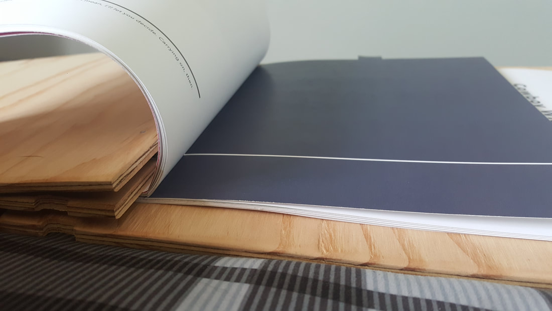
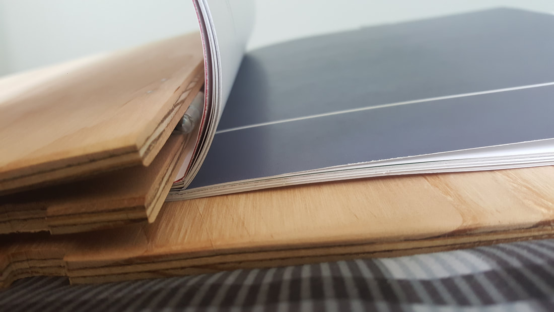
I really liked the overall aesthetic of my existing portfolio. I felt it did a really good job of conveying a theme that is very common in my work: merging ideas of traditional, rustic, cowboy culture with clean, modern, fresh design. The main thing that I wanted to adjust was the binding. Even though I really liked the way the binding looked at is was certainly functional, the sheer bulk it had created a bit of an uncomfortable dilemma as you flipped further into the book. The pages didn't lie over on their own, and it wasn't very user-friendly in that regard.
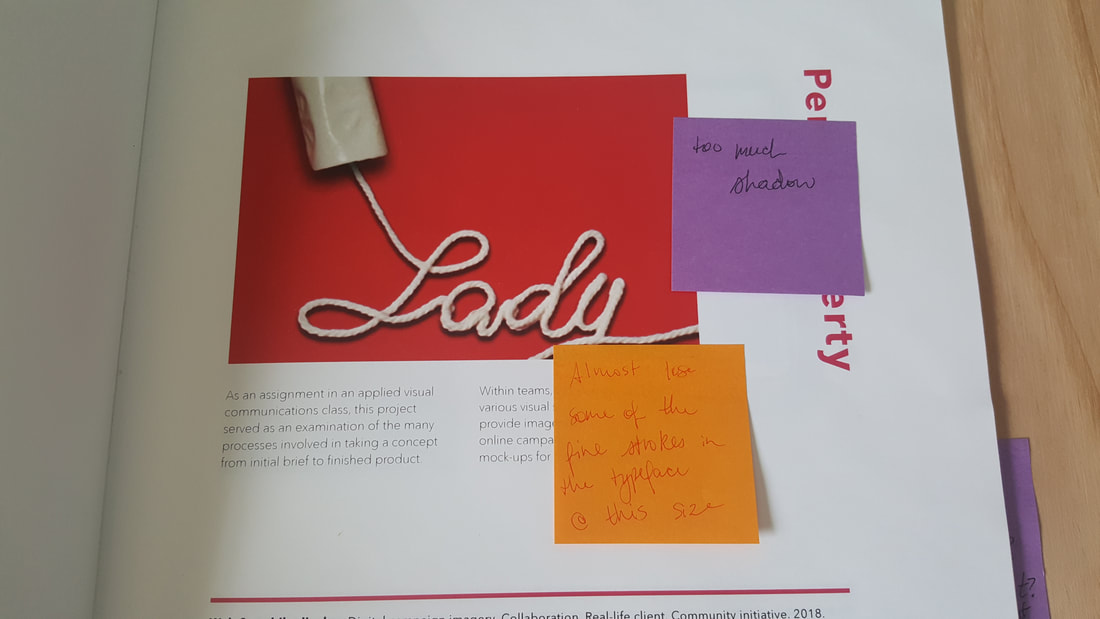
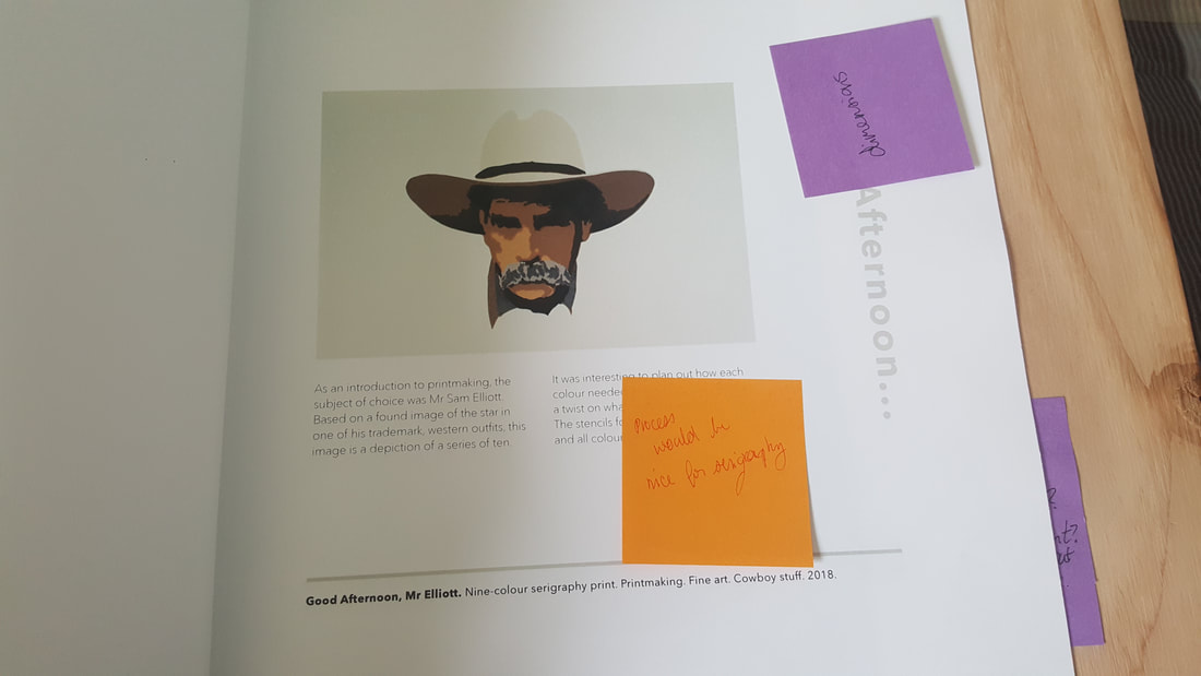
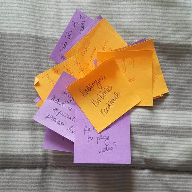
Since I already had a plan to address the binding issue, I flipped through the book quickly myself to find and make note of any other changes I wanted to make before taking it to Ian and doing the same with his suggestions. Pretty quickly, my portfolio was covered in sticky notes.
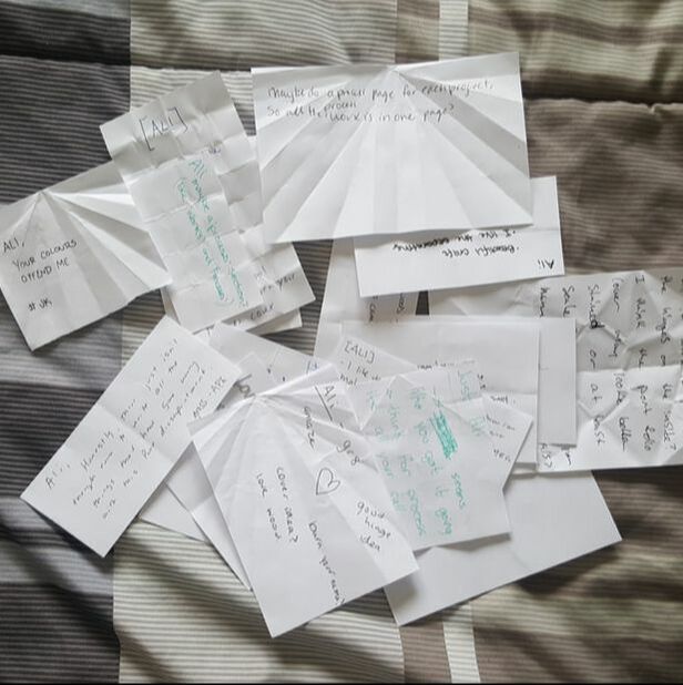
I used these sticky notes, as well as feedback from my classroom critique:
To begin, I needed to update my layout to account for all of the page space I was gaining by eliminating my bulky binding method from earlier. In this new method, the entire page would be exposed. From there, I dropped in new projects and modified the layouts of existing projects to fit.
A digitally mocked-up version of my final portfolio design:
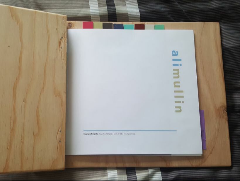
These pages were printed at Staples using 65lb cardstock at 8.5"x11". I designed my layout in a way that I wouldn't have to cut any pages, except the colour-coded dividers used to indicate each project. Those dividers were printed on 11"x17" cardstock, then cut to size with tabs.
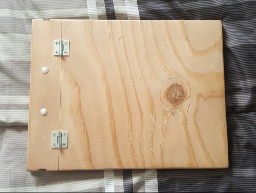
Everything was assembled together with sanded plywood covers I had previously prepared, and hardware that was repurposed from a previous assignment. While I planned to use a strip of leather as a decorative feature covering the screw-heads, doing so actually made the interior of the book too big for the covers to be able to close properly, so I took that part off. I like the way the screws look when they're exposed anyway, and this makes the whole thing easier to add to in the future. Analogue Portfolio Rationale
In the end, I'm very pleased with how my portfolio turned out. I feel that it has just enough of a rustic, western flair without being too overdone. Since creating it, I've had lots of compliments on the unique cover and because I kept it simple, I don't think that it upstages the work inside.
Through use of a bright, white background, coordinated imagery and colour, this portfolio works well as a compliment to my online portfolio. While I had planned to incorporate leather elements in the analogue version, I like how it looks this way. In the future, if I was going to revisit that idea, I would start by trying bigger hinges, so that the covers might be able to close. In the meantime, I think it serves its purpose as being an intriguing way to showcase my work, and in its own design it opens up an avenue for conversation about my background and my design practice. | ||||||||
Powered by
 Create your own unique website with customizable templates.
 Create your own unique website with customizable templates.
